The first time I ever looked at a price chart, it was intimidating. There were boxes, lines, zigs and zags and I had no idea how to begin deciphering the information displayed in front of me. But once I got a grasp of the basics, charts slowly grew to become an integral step in my analysis process. Charts tell us a story about how price has moved in the past with the hope that we can use it as guidance for the future. My focus in this article will be unmasking popular chart types, explaining how time frames work, and the difference between bid vs. ask prices.
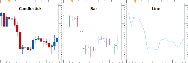
Chart TypesThere are 3 types of price charts that you are likely to experience in your trading career: Candlestick, Bar, and Line charts. They are all created using the same price data, but display that data in different ways. To explain, the image below displays all 3 types of charts using the same set of price data.
Learn Forex: Three Most Popular Chart Types Candlestick Charts
This chart type displays the opening, high, low, and closing (OHLC) prices for each period of time designated for the candle. The “body” of each candlestick represents the opening and closing prices while the candle “wicks” display the high and low prices for each period. The color of each candle depends on the applied settings. But in the image above, every candle that is blue means the price closed higher than where it opened (often called a bullish candle), and every candle that is red means the price closed lower than where it opened (often called a bearish candle). This is by far the most popular chart for trading forex.
Bar ChartsThis chart type displays the opening, high, low, and closing (OHLC) prices for each period of time designated for the bar. The vertical line is created by the high and low price for the bar. The dash to the left of the bar was the opening price and the dash to the right was the closing price. You can see the similarities between this chart type and a candlestick chart when they are sitting side by side.
Line ChartsThis chart type usually only displays closing prices and nothing else. You will see this type of chart used on television, newspapers and many web articles because it is simple and easy to digest. It gives you the less information than candlestick or bar charts, but is much easier on the eyes with a quick glance.
Time FramesA chart's time frame describes the amount of time it takes to complete a single candle. If you select a 1-hour chart, that means a new candle is created every hour on the hour. If you create a daily chart, that means a new candle is created each day (at 5pm ET). If you select a 1-minute chart, that means a new candle is created every minute. Etc.
Forex traders looking to decide what time frame to use can read about How Chart Time Frames Affect Forex Analysis.
Bid vs. AskThe last piece of our Forex chart is decided by whether we want to look at Bid prices or Ask prices. The side we choose will depend on whether we are wanting to place a sell order or a buy order. Remember, there are two prices for every Forex pair.
The bid price is where we can open a short(sell) position or close out a long(buy) position.
The ask price is where we can open a long(buy) position or close out a short(sell) position.To be clear, we are free to place any type of order that we want no matter what chart we are looking at, but if it appears like our trade opened at a strange price or we were stopped out early on a trade when referencing the price chart, this is most likely due to us looking at the wrong side of the price.
Are you ready to access real-time Forex charts on a fully loaded trading platform for free? Try out a FREE Demo account.
Good trading!